Links
Teacher / parent notes
Desk Top Publishing
In Lesson
11 I said that dtp makes a newspaper, poster or magazine much easier
to produce than the old-fashioned technologies of wood or metal type.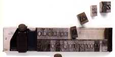
However, just because it is easier for the amateur does not mean that an amateur can produce a professional product. The greatest crimes against typography have been committed by people practising with dtp but without the slightest idea of what makes good typography.
Typography is the art of printing and it is the study of letter shapes. A typographer can design letter shapes and design a page layout to look both readable and attractive (which are not always the same thing.)
I can't teach you to be a typographer in these lessons - that takes a lot of training and experience - but I will give you some features to look for in the hope you will improve your design sense.
1. Use an appropriate font for your message. Look in the magazines you read and see what a great variety of typefaces there are. Some may be appropriate to your message and some are not. A funny font with letter shapes of people in fancy dress may be appropriate to your party invitation but it won't be suitable for a History essay.
2. Look at the white space around the letters as well as the letter shapes themselves. This will help you balance your words properly. Especially in large font sizes there are problems balancing the letter pairs LY because of the white space between them. The pair IL has much less white space. So in the word SILLY it may be hard to balance the spaces without adding a little between IL and moving LY nearer to each other. In the same way AA and VVare far apart, but AV and VA are closer. Professional dtp programmes will either do this for you or let you do it easily yourself. It's called "kerning."
3. Don't mix too many different fonts on one page. It's rarely necessary to have more than two fonts, such as Helvetica (Ariel) and Times on the same page for a formal piece of writing, and you can mix bold and italic from the same family together.
4. "Body Text" - that is the main block of writing, not the headings, subheadings and captions, will usually be at 12 point size, though it can be reduced to 10. Larger than this it looks childish, smaller it is difficult to read in large areas."Leading" (pronounced "ledding") is the word used to describe the space between the lines because originally it was a thin strip of lead. Don't reduce the leading below the size of the font.
5. Paragraphs should be separated clearly. Use an extra line space or an indent to show where the paragraph begins.
6.
Keep the column width narrow for easier reading. Newspapers are designed
for easy reading and they use several narrow columns rather than one wide
page. Decide also whether you want your text straight on the left, ragged
on the right hand side or straight at both edges.
Straight on both edges is called "justified text" and is used
in formal situations. This may leave awkward gaps in the middle of lines,
which can sometimes be avoided by using hyphens, however some readers
don't like hyphenated text.
A good book on typography or page layout will tell you much more, and looking critically at the design of pages in newspapers, magazines, letters, brochures etc will give you good ideas which you can try to carry out in your own designs.